Friends Select’s New-ish Gym Floor
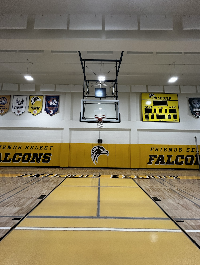
In 2013, Friends Select changed their logo to a new, modern style. To match this style, the marketing team designed a new gym floor in 2018. Because of the new design of the Friends Select logo, a redesign of the old gym floor was necessary.
The logo change was requested in 2013 to be done by 160/90 Agency, after decades under the old logo. The administration agreed that the school needed a new design to fit the style of modern logos. The marketing team decided to hire a designer for an outsider’s perspective on the school. Once the final logo was designed and picked by the school, other equipment such as uniforms, the gym floor, school banners, and merchandise, needed redesigning as well.
The gym floor redesign was spearheaded by Associate Director Marketing, Creative and Visual Communication Tina Dougherty, who was excited to take on the project. “My goal was to visually brighten up the space and create a unique court design to our gym floor,” explained Dougherty. With this goal in mind, she researched college and professional gym floors.
Once she had three prototypes finished, a meeting was held with Michael Gary, Head of Friends Select School, Mike Noonan, Director of Finances, and Bill Klose, Athletic Director. “It was important to get feedback from everyone because they brought a different perspective to the decision,” said Dougherty. Klose and Dougherty chose the final design, then handed it off to Bob Bessey, from Jack Devine Gym Floors, to execute the change.
Since the gym floor wasn’t shown to anyone before the release, many students had opinions on the new design. To Dougherty’s intentions, Hannah Feinberg, class of ‘20, said, “The bright colors and new logos make the gym look new and cleaner.”
Similar to Feinberg’s response, Alex Haurin, class of ‘21, described the gym as “more vibrant” and “giv[ing] more life to the gym.”
Taariq Heavner-Mbaraka, class of ‘21, likes the new gym for a different reason: “The new logo [on the floor] gives off a certain dominance and intimidation the other one just didn’t have, and [it] just looks so much sleeker too, it looks like it’s a place to come and see two teams give it their all.”
However, Ethan Pastor, class of ‘21, was unimpressed with the new colors, describing them as “duller” and saying that yellow, as the primary color, is “annoying to look at.” But from the overall responses, people favored the new design.
“It was an exciting and challenging design project from beginning to end. Seeing the gym floor come to life with the new Friends Select Falcon and how it changed the room visually was amazing,” said Dougherty.

