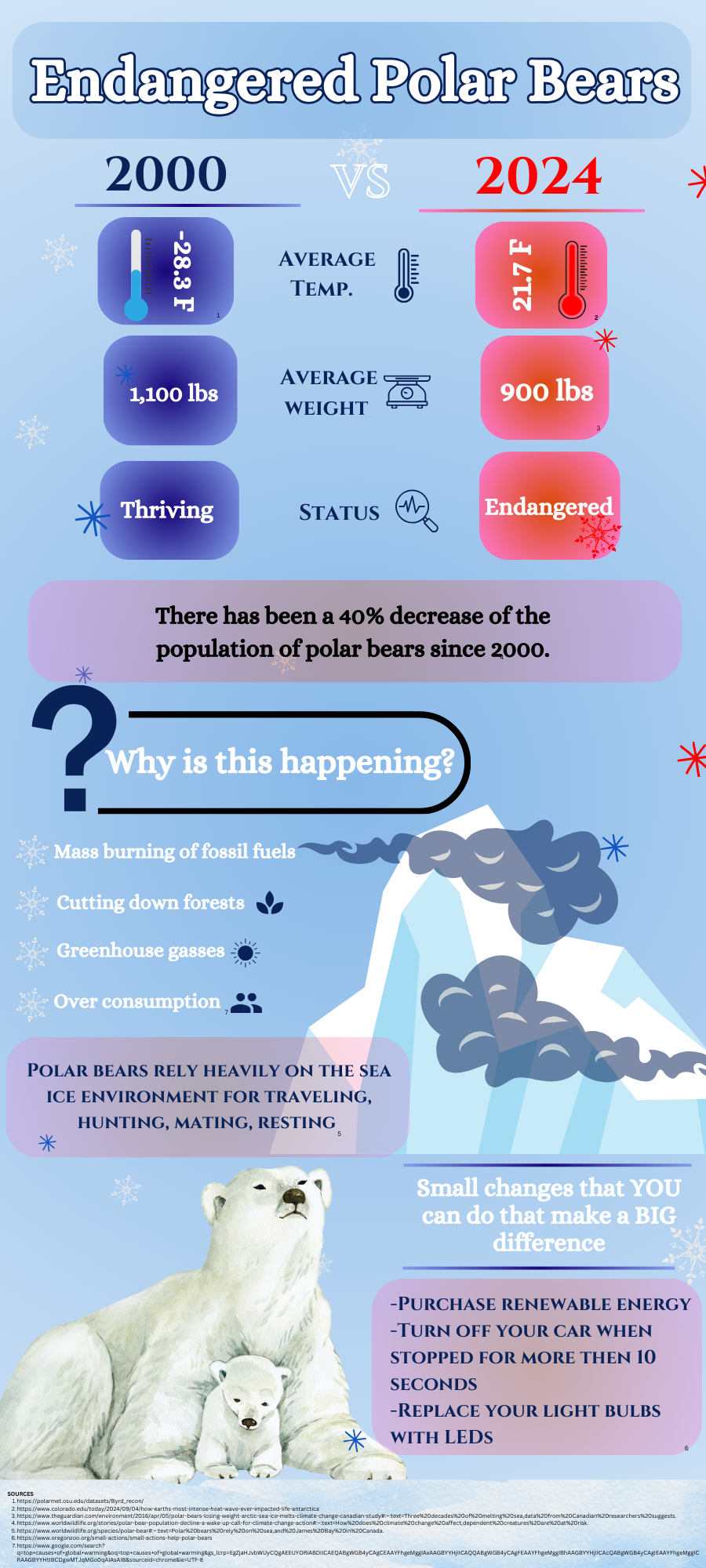
This infographic is a comparison of Antarctica’s temperatures in 2008 vs. 2024 and how this affects the polar bears living there. This comparison shows the difference in temperature, weight of polar bears, # of bears living, reproduction rates, and status. This graphic was made on Canva using images and stats from outside resources. This infographic shows the negative effects that global warming has on the species and shows how we can help them survive.
Did You Know This About Endangered Polar Bears?
Sofia Rouco
•
December 16, 2024
0
More to Discover
About the Contributor

Sofia Rouco is a senior at Friends Select who joined the community in 10th grade. Sofia is the founder and leader of Latino Student Union as well as the leader of Yoga and Wellness Club. She participated in the Girls Varsity Basketball Team as well as the Girls Varsity Field Hockey Team. Outside of school, Sofia is a waitress at an Argentinian restaurant and enjoys going to the gym.


